Probably too late but this video is really worth a watch- so creative!
http://uk.youtube.com/watch?v=lBvaHZIrt0o&feature=related
Tuesday 23 December 2008
Thursday 18 December 2008

Monday 15 December 2008
Inspiration: Flip Flop Flyin'

Here is a selection of images by the artist flip flop flyin'. Really nice stuff at http://www.flipflopflyin.com/

Friday 12 December 2008
site map
 this is a very early template of the site map, as not all the images
 have been placed and some updates are needed....just to give us an idea
of what it will look like..
Thursday 11 December 2008
Goggles Inspiration

I took a screenshot of a Star wars film as inspiration to putting on goggles for our mountain!
Tuesday 9 December 2008


Monday 8 December 2008

Thursday 4 December 2008
mountain font
 this is an idea for the way the font can be laid out on a mountain?
nice header for the blog by the way.


Wednesday 3 December 2008
illustrator images

 made a quick flag and threw some of the things together.
what do you think?
group 30 is the best!!

tree pixel thing
 what do you think about this?
better link to other characters.
snow or no snow?
throw some ideas out there.
GOOOO group 30!


Tuesday 2 December 2008
Inspiration - Wolf Theiss

This is a poster from an Australian Law Firm. I thought the style was interesting and related in some way to our typography experiments.


pixel

pixel man
played around with shapes in photoshop for the character, wot u think? this the kinda thing we were talking about?
Artist Link: Devandra Banhart


Here are some images and a link. I was thinking the textures used were really interesting even if the illustrations are a bit unusual.
http://www.devendrabanhart.com/ (Under the 'Art' Section)
Monday 1 December 2008


gifs
hello ive made a couple on my computer, but they wont load on this for some reason. not ideal.
but i wil bring them tomorow or soemthing on mem stick.
Concrete Poetry
"Concrete poetry, pattern poetry or shape poetry is poetry in which the typographical arrangement of words is as important in conveying the intended effect as the conventional elements of the poem, such as meaning of words, rhythm, rhyme and so on.
It is sometimes referred to as visual poetry; a term that has evolved to have distinct meaning of its own, because the words themselves form a picture."
It is sometimes referred to as visual poetry; a term that has evolved to have distinct meaning of its own, because the words themselves form a picture."
Sunday 30 November 2008
Artist Link: Sam Winston
Following the tutorial we decided to further explore the typographical element to the brief by looking at the work of Sam Winston. Here is a selection of his work and a link to his website.

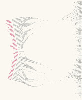
"Through his explorations of language Sam Winston creates sculpture, drawings and books that question our understanding of words, both as a carriers of messages and as information itself."
http://www.samwinston.com/


"Through his explorations of language Sam Winston creates sculpture, drawings and books that question our understanding of words, both as a carriers of messages and as information itself."
http://www.samwinston.com/
Thursday 27 November 2008
overview of tutorial
ian- just so your up to date on what was said in the tutorial, basically the main thing we need to explore nw is typography. Jon suggested us looking at 'concrete poetry' and also 'sam winston'....play around with type, could b in the shape of our mountain on the homepage, think about ways it could be displayed eg curves left in snow by snowboard..... This is what we need to start looking at and have a few visuals done by mon (use concrete poetry as reference) its useful for inspiration.
Wednesday 26 November 2008
www.sbhistory.de/
only wanted you both to see this website, because when the mouse hovers over the circles, they change colour....gave me the idea for our flags. they could change colour when the user wants to click on a certain one.
also the website for a good snowboarding site
Artist Link: Superbrothers
Here is a link to the Superbrothers website and some examples of their work
http://www.superbrothers.ca/
Tuesday 25 November 2008
idea
i thought of something similiar to ur idea of the tricks, i thought could have a sloped mountain, the mouse could hover over the snowboarder and would appear in colour, whereas before it would just be a black outline. I thought about the character could go up a mountain via a ski lift, reaching certain targets (which are the facts) ...


other idea
 10 things you need to know about this ski resort blaa blaa....?
Could select certain peaks and the different colour runs will appear - text could appear in the direction of the runs. idea of typography
could just select blue/red/black runs and they will all appear - running down from the top?
Initial ideas
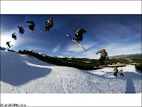
 Could have something like this - each character could be faded and then highlights normal colour when scrolled over. and information could appear. (step by step how to do trick)
Could have it so each time you roll over person the colour of person fades and the outline is the shape of the text?

Subscribe to:
Posts (Atom)